MAKE THE MUSIC VISIBLE.
The artwork had to do more than package tracks. It needed to create a visual language that could hold the emotional range of the album and still be instantly recognizable in a feed.
Case study · Design · Art direction
Jovanko & Waters needed an album world with range: intimate, graphic, strange, and memorable enough to hold across cover art, singles, and promotional visuals.
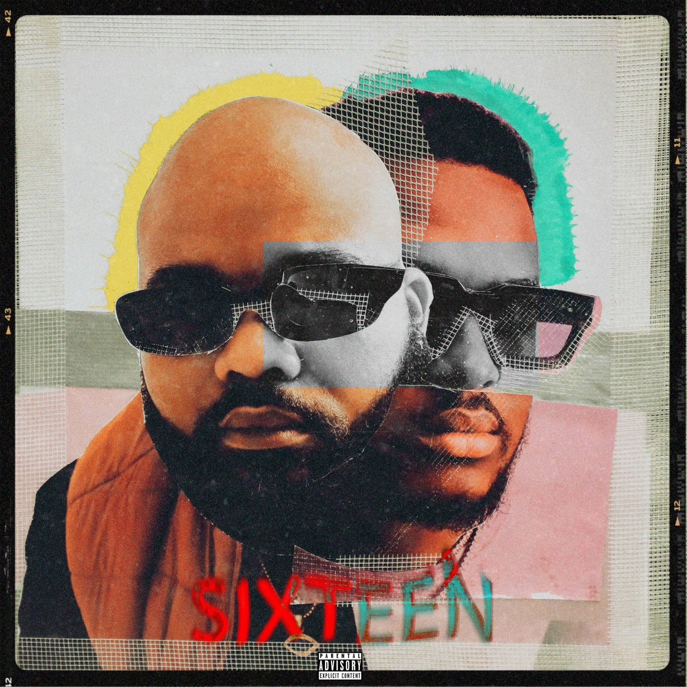
The artwork had to do more than package tracks. It needed to create a visual language that could hold the emotional range of the album and still be instantly recognizable in a feed.
We combined portraiture, distortion, texture, and bold composition to create a system that felt fragmented and cinematic without losing clarity.
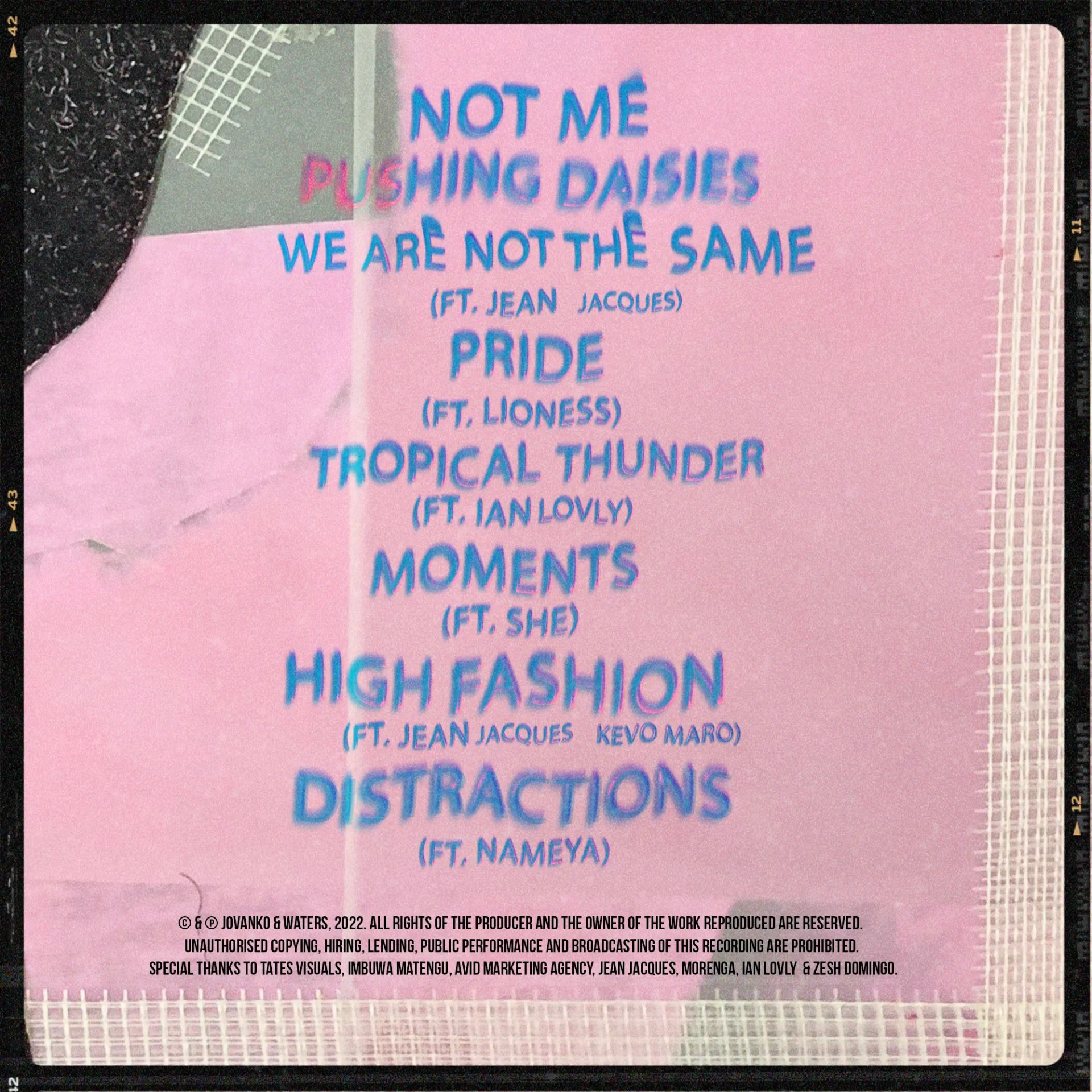
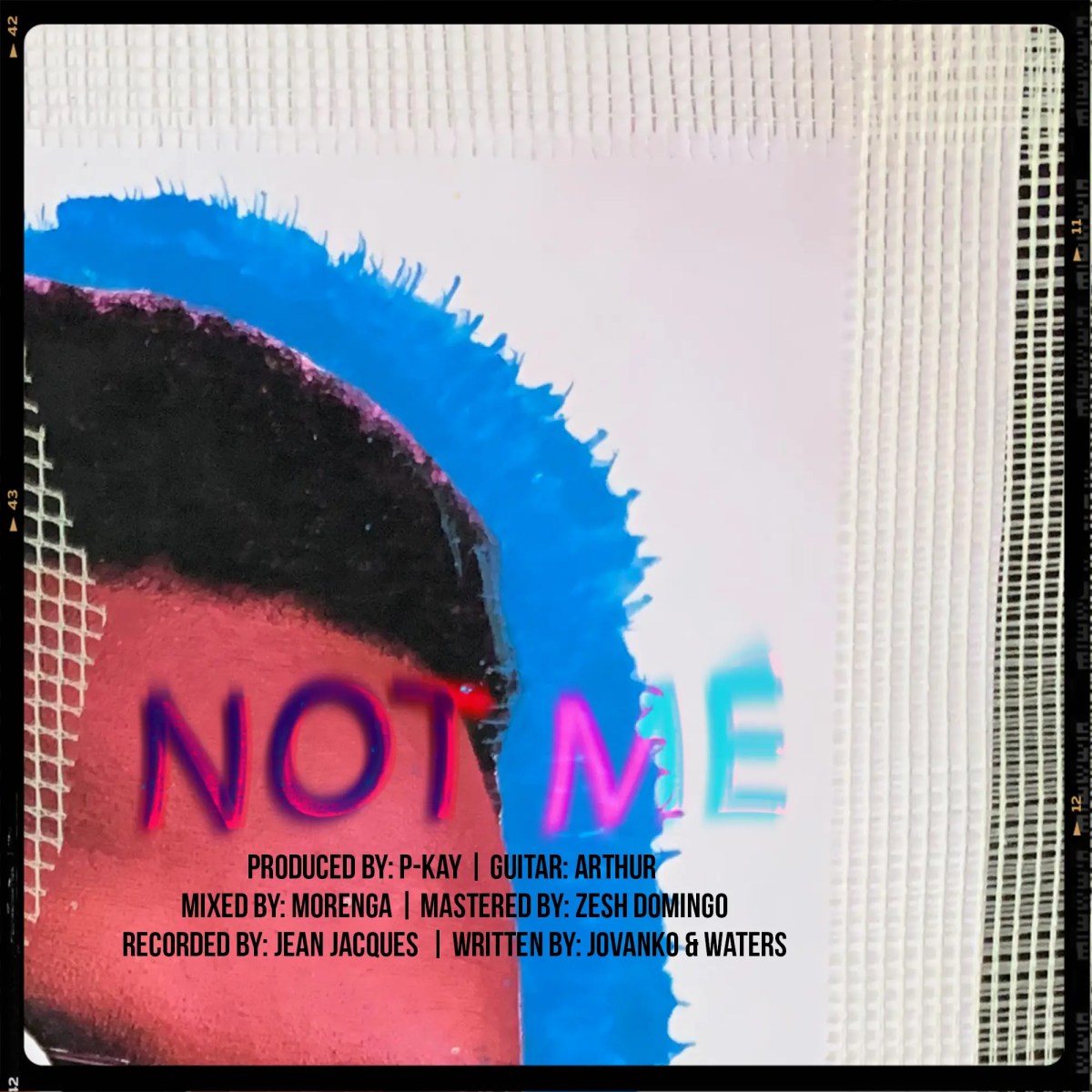
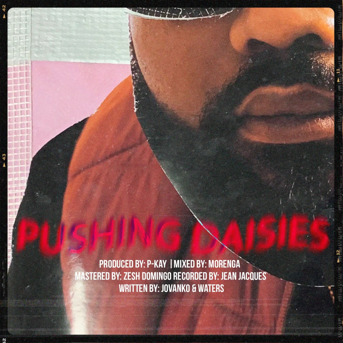
The final artwork created a campaignable album identity: cover, back cover, singles, and photography that all felt like parts of the same visual universe.
Project proof
The album needed artwork that could hold emotional range and still be recognizable in small feed formats.
Cover art, single artwork, photography, and promotional visuals now feel like parts of the same visual universe.
The system gives the release material for teasers, launch posts, artist storytelling, and culture moments beyond the cover.
THE COVER HAD TO SOUND LOUD BEFORE PLAY.


Next move