MAKE TRUST FEEL IMMEDIATE.
Baby brands carry an emotional burden: they need to feel safe before they say much. The identity needed to move beyond decoration and create a recognizable, reassuring system.
Case study · Branding · Identity
A trusted baby brand needed a system with warmth, clarity, and shelf presence. We rebuilt the identity so care could feel commercially sharp without losing its softness.
Baby brands carry an emotional burden: they need to feel safe before they say much. The identity needed to move beyond decoration and create a recognizable, reassuring system.
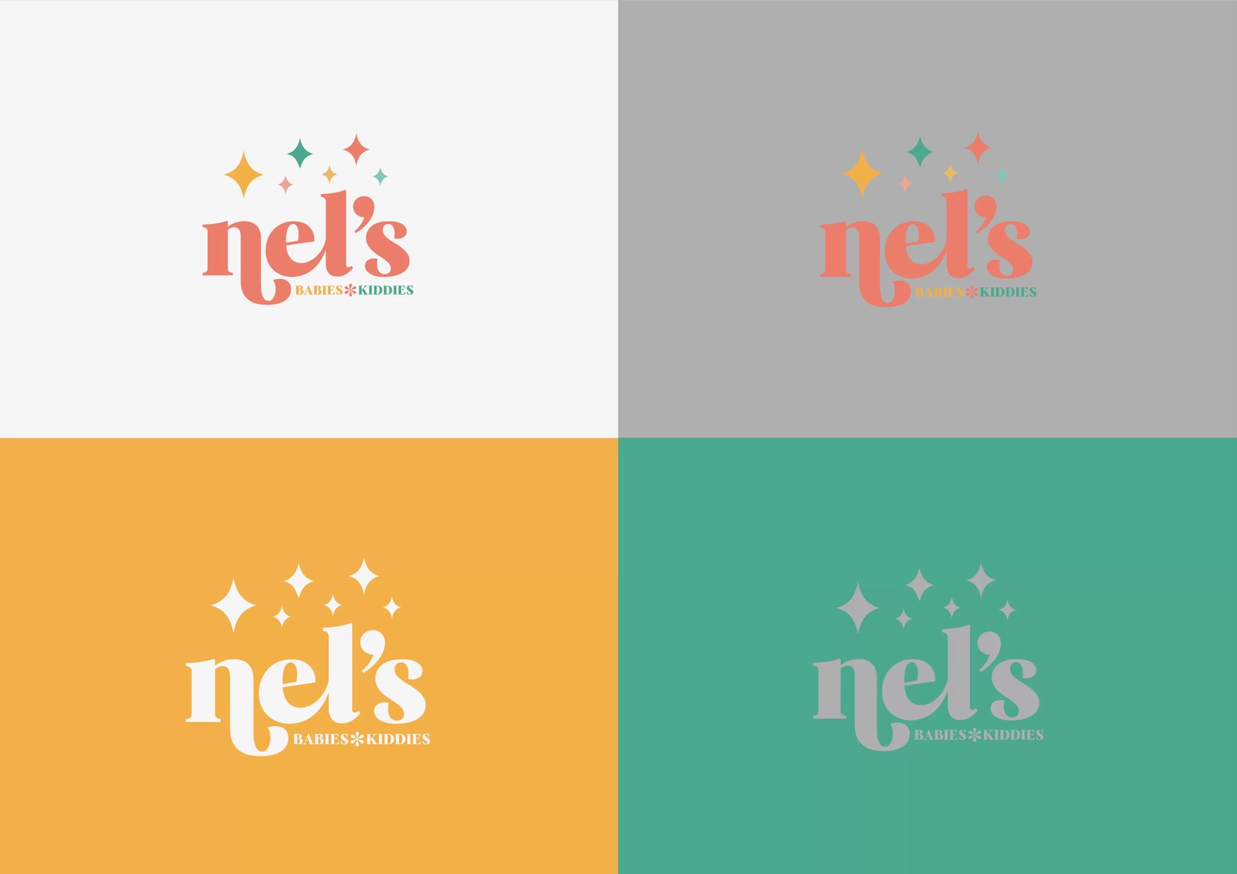
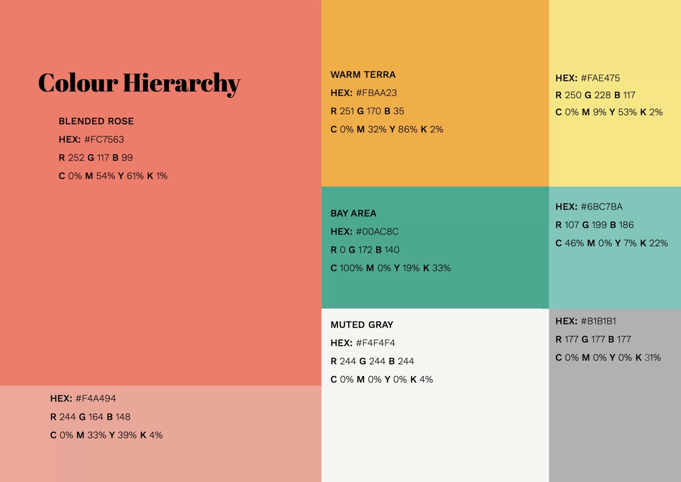
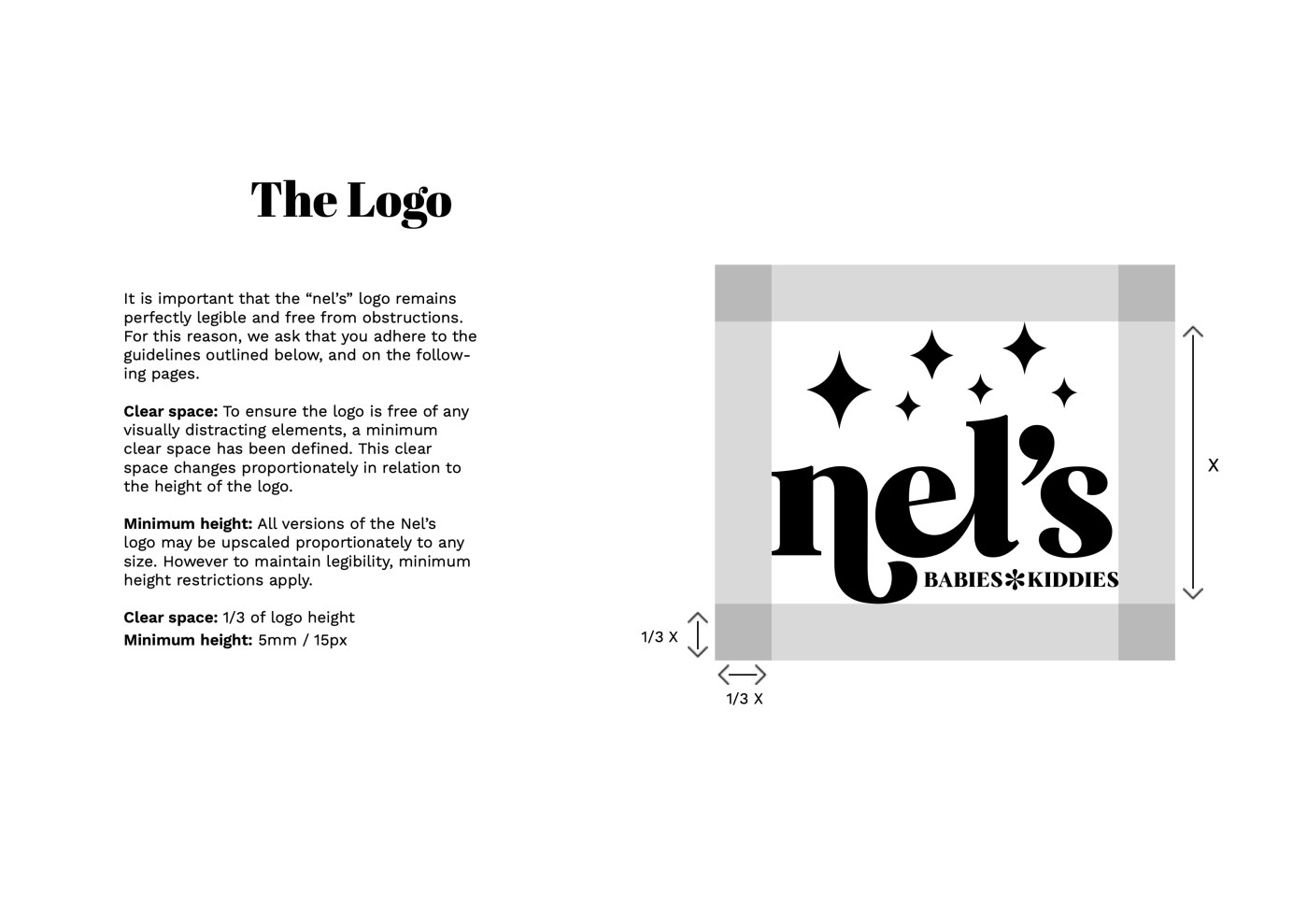
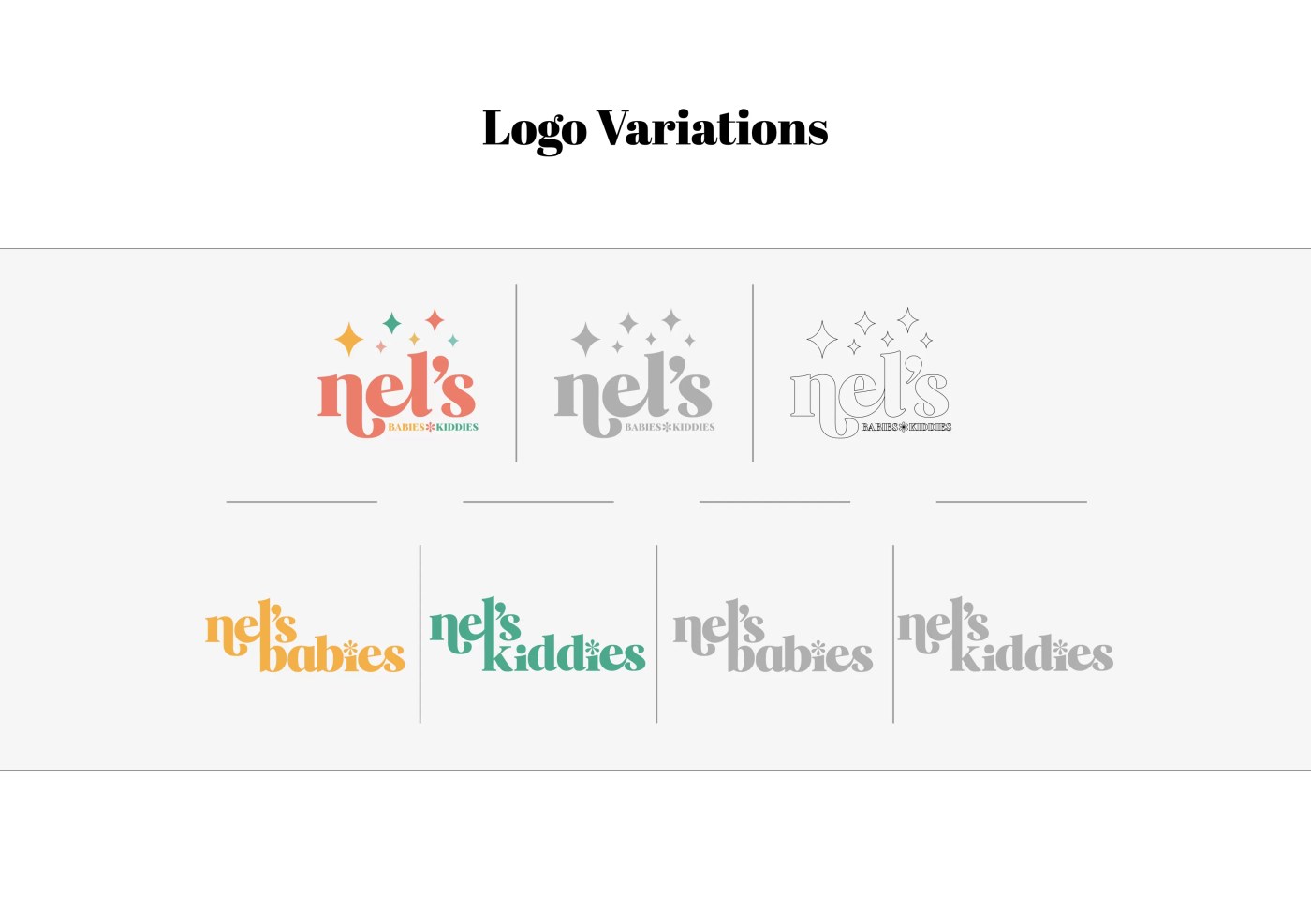
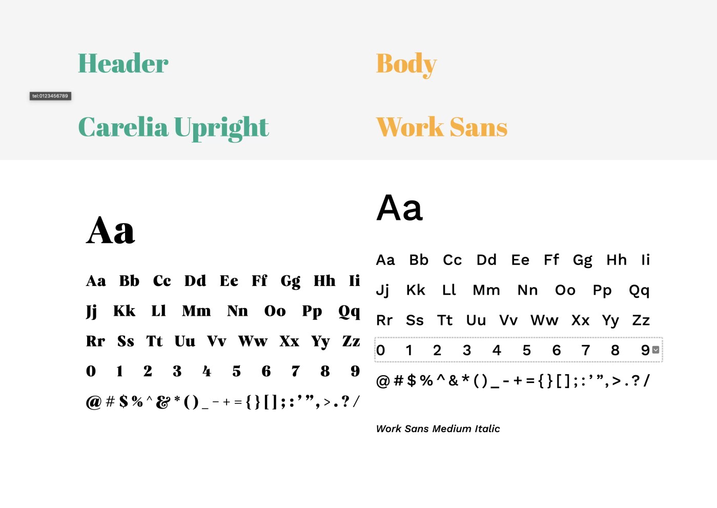
We sharpened the visual language around softness, legibility, and repeatable brand marks, creating a system that could scale across digital touchpoints, packaging, and customer communication.
The rebrand gives Nel's Babies a stronger commercial face while preserving the warmth that makes the brand easy for parents to trust.
Project proof
The brand needed a clearer visual system that could communicate care before customers reached the details.
The rebrand gives Nel's Babies a warmer, more legible system for packaging, digital surfaces, and customer communication.
The new identity helps the brand feel safer, more memorable, and more consistent at the moments that influence purchase.
SOFT DOES NOT HAVE TO LOOK SMALL.
Next move